1.30.2009
field notes day 2
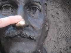
A Mizzou tradition complete. There are several things I want to do before I graduate and leave Columbia. The saying goes that if you rub David R. Francis's nose before you take a test, you'll have good luck. I didn't have a test on Thursday, but I need all the luck I can get. Over the past four years of being on campus I have never rubbed the nose of David R. Francis, and with less than four months left as a student, the time has come.
field notes day 1
Days when creativity is hard to come by, I look at my surroundings and start using my imagination. Sometimes I'll let my mind wander around looking at patterns and architecture of spaces, but other times, like today, I simply put my wooden artist's model on the floor and played with different positions and postures before snapping a few photos. I really like this photo because the coloring is monochromatic throughout. It is also shot from above which ads depth to the photo as well.
This is photo one of the week's compilation. Stay tuned to see what else I might do.
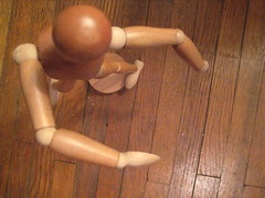
This is photo one of the week's compilation. Stay tuned to see what else I might do.
1.29.2009
What's next?

A moment of silence for all who follow Domino.
Maybe one day my three year collection of Domino magazine's will be worth more than the sheer inspiration and creativity that is encompassed into each issue. As of January 28, 2009, Conde Nast bid adieu to modern-girl's guide to surviving in a one bedroom apartment in New York City, in style. Many home magazines are geared towards the generation of home owning, mother's-day-out, do-it-yourself weekend project women who buy more for practicality rather than pure spontaneous indulgences! Please do not take that the wrong way, I like all magazines and am an avid reader of Better Homes & Garden, as well as Scrapbook Etc., but ever since I picked up my first issue of Domino magazine I imagined living in the cover picture. That has been my dream, and Domino has been my monthly guilty pleasure, as opposed to the weekly, US Weekly. Read more about the fold here.Now take a 180 with me - Reader's Digest. I read and heard this morning that Reader's Digest is planning to layoff 300 people due to the current soft economy. Continue reading more from the Fish Bowl.
Can it get worse? Will it get worse before it gets better? Can it get better before May 16 (i.e. when I graduate and throw myself into the workforce).

What about new magazines that have recently been started? BOHO magazine has been my latest obsession, releasing it
s premiere issue in November 2008.
Check out their website, their mission statement, is without a doubt BOHO in a nutshell.
1.28.2009
Response

The battle of selflessness versus selfishness.
Yesterday two of my teachers (from different departments) said the same thing and both times I heard it, I caught myself repeating it in my head, as if it wasn't true.
"Don't do anything for me. Do everything for yourself... you'll be the happiest."
As many times as I roll it around I think, "so it's OK to be selfish?" I know this may seem really silly and probably nothing worth dwelling on, especially how I am doing it yet again while writing this post. But remember growing up and the concept of "sharing" was instilled into your brain? I believe the five letter word was plastered on my forehead as a child as a constant reminder.
I told you this is silly, and I realize I have taken it all a little out of context or a little to far, but at it's core I really just took it literally. Each teacher was expressing, "write for yourself... design for yourself... do what makes you happy... make yourself happy first and then you really can be happy..."
As much as that makes sense it's hard for me to step back and realize; "I don't have to please everyone else first?"
I'm beginning to notice that when I am designing in the realm of my desires, I am much more creative and passionate about the work I do. If I am not happy with the work I am doing, then nothing comes together (i.e. the past assignment I posted).
Wayne Gretzky said, "You miss 100% of the shots you never take." If I play it safe and design to please everyone else, then I will never be satisfied with the end result, therefore I am challenging myself to go to take every shot I get because I never want the opportunity to miss if I didn't try.
Critique
I will be up front and honest, I am my own toughest critic. This past week I got my first assignment for VOX magazine: a cover and feature competition. Along with 16 other designers, we each came up with our own concept and designs.
No pressure right? Wrong! I sketched for a couple days trying to come up with ideas, I brainstormed for hours, but literally the the light bulb never turned on. With lack of creative juice flowing in my veins for the past several days, I was stuck. Eventually I had to stop avoiding the assignment and just do it... whether or not I got inspired.
Result = disaster... trash... an embarrassing product.

Working on the cover I thought, "
okay this is going to be cool, I can do a lot of things with this." Too ba
d I tried to think "symbolically" and missed the boat by several feet. After working on a photo illustration of a couple band members in an ornate building, I
decided that it was good, but not relative. Therefore I went back to the starting block. "Be seen. Be heard..." I got attached to this head because it was a literal interpretation of my symbolic graphic. The cover story is about musicians who are beginning to license out individual songs as opposed to waiting to be signed with a company. These songs are being used in television shows, movies, etc.

Secondly, the feature. A story about the economy, but localized. The story is amazing and I really wish I could have done something to give it justice, but this might have been one of the worst designs I've actually saved, and printed.
A redesign of both will be coming soon, including an improvement.
Follower
I am a follower of typography.
Anything typographic.
The author of ilovetypography.com has an explosion of typographic inspiration. This past summer I stumbled upon this site in search of a certain font that my employer was interested in finding. Ever since, I have referred to iLT for new ideas and typographic concepts.
A great success in my opinion. One of my favorite aspects of ILT is the addition of typographic history. How did Baskerville originate? Why is Times New Roman the default font for Word?
Dating back to the 1700s, the origin, development and progression of type is incredible.
Mixing my interest in typography with my hidden, "inner-nerd" obsession with history, iLT pulls all the pieces together. Regardless of making history, studying history, or stumbling upon worthwhile historical information, there is a great deal of rhyme and reason within the world of typography. From type representing the Industrial Revolution to san serifs originating during the reign of Napoleon, iLT explores the evolution of type and how things have changed, remained the same and merely become digitized.
Beginning
"A good beginning makes a good ending."
Beyond the Gutter means pushing the limits, trying anything that comes to mind and stepping outside the box and outside of one's comfort zone. Through this blog, I want to challenge myself as well as others, to pursue creativity, embrace all kinds of design, and form a greater appreciation for artists.
Subscribe to:
Posts (Atom)


