2.25.2009

more work to show


Here are some updates on the work I have been doing in the past week; I know I have posted about it all numerous times but I haven't shown it. Well ta-da: the good, the bad, the ugly, and the published.
The series of pictures is the progression of where my thoughts started with the concept of bed and breakfast and where they ended, or how they ended I should say.


As you can see my thought process changed quite a bit while working with the theme of bed and breakfast.  The top  is the finished product, and the order of the pictures shows the progression of designs I went through before deciding on a concept and final design. I wanted to play off  the idea of old vs. new, to get the feature a "Vox feel." Once I did the color vs. black and white, half and half approach, I wanted to run with it. Finding the right image was crucial. As you can see from the blue image I only found a black and white photo and had to show interpret what I meant on my own. But the idea sold and we went with it. I think the cover turned out nice, classic, "kitchy" if you will. 

What the font. check this out.


I'm addicted to my Blackberry, or as known to most as, the crackberry. But seriously I might be able to go to identifont.com and find the font of a unique font, my blackberry cannot do this --

typography.com posted a test they used from a random sign to see if "What the Font" really worked. Check it out, it's pretty close and it's like "identifont" at your fingertips. First the iphone can gchat, now "what the font!" really, maybe i need to upgrade. If I said it was necessary to have a font identification program at amy fingertips I could convince my parents that I cannot go on another day as a designer without this program, or aka, the iphone.

A bit dramatic, but I haven't been overly impressed with many iphone applications that I have seen. Come on, who can beat Brickbreaker on the Blackberry?? 

critique


first draft
Originally uploaded by maggie searcy
WOW. I have survived the past two weeks. I’ll admit, at 6:00 a.m. last Wednesday when I was still awake working on one of about 500 projects, I was asking myself why I really care so much and why I am so concerned. I see people everyday who don’t have a ton of work to do or don’t care about school, but I can’t relate. It’s totally not my work ethic.

I mean, come on, I’m trying to come to terms that I can’t actually accomplish everything on my to-do list before 10:00 p.m., which yes, was the usual time I went to sleep before this semester again.

In the past 24 hours I have realized yet again why I love designing, why I am passionate about the amount of picas between the head and dek of a feature, or the about of points the thickness of a stroke is and how each detail can make a huge impact. Ah! It’s like a love language!

The math side of my brain got to me today and between 2 o’clock on Friday and 5:30 on Sunday afternoon, Lauren and I spent nearly 30 hours at VOX. Even with the infinite playlists, courtesy of Pandora and the slaphappy humor that evolved over our lack of sleep, we put all we had into this week’s feature. Oh! I am so excited to see it in print tomorrow. Before I reveal the entire thing, the picture to the left is one of the first drafts of our splash page. The feature is on the True/False film festival that is taking place in Columbia this weekend for the sixth year.

Lauren and I had a product we were proud of, but things can easily change when we begin getting inputs from other people – always a good thing, but not always something I want to hear. I had become attached to this red box that anchored the first page of the feature, but since we are limited on space, the “blank space” of my red box had to be tossed, and text had to be added.

The moral of my critique is hard work does pay off. The hours of brainstorming, learning new software techniques, and designing as a pair, was a learning experience as well as a boost of encouragement after completing this huge feature.

Of all the time I have spent on the computer, designing and creating the past week, I never got burnt-out. I wanted to stay up and make my designs better and keep executing ideas but I finally had to let myself sleep. The adrenaline rush that has come over me in the past 48 hours has put me on a high... and reassured me that I am in the right place, doing the right thing, --doing what I love.

Sometimes reassurance that you’re doing the right thing and you’re on the right track is a positive reinforcement that hard work does pay off.

And sometimes, even through all the stress that life brings, and the endless to-do lists, a lot/if any reassurance is recognized, and coming at this time in the semester, I think this is a push to remind me “why I love what I do!”

2.17.2009

Critique

The past seven days have been hard to differentiate. Last Thursday Lauren and I presented our general concepts and rough ideas for the True/False Film Festival feature story for VOX. The same day I also pitched two redesigns for the February 19 cover. I found out on Thursday night that my concept was chosen for the cover. I really like the final product. Tomorrow I will post the new cover, along with the other ideas that were generated along the way. 

In between working on the cover and reworking ideas for the upcoming feature, I had to work on a draft to pitch to for my larger semester project. Needless to say, I’m turning into a major computer-nerd/design-geek that can only talk and think and yes, only dream about design. *Side note: always keep a pen and some paper next to your bed in case a brilliant idea pops into your head at 3 in the morning because if you’re like me, there is no way your going to remember it four hours later.

I am posting pictures of economy feature that I redesigned since its original post. I like these two much better than the spread I turned in the first time. 

Response

What do we really do differently now that we didn’t do years ago? Has anything really changed, or has the process merely become quicker due to the age and development of technology?


Yesterday I did a presentation on Collier’s magazine. It began in 1888 and greatly impacted the industry until it closed in 1957. While researching for this project I got lost in the library stacks going through decades of the weekly publication. It amazed me to see how, (a) they were in the forefront of their competitors and reaching upwards of a million readers within the first 10 years, or (b) have we, as designers merely regurgitated ideas and designs that have already been done? Is anything really new?  


Let me back up a little bit... I believe it is all of the above. The impressions that photographers and artists like Jimmy Hare, Will H. Bradley, J.C. Leyendecker and Edward Penfield have created in this century old concept are astounding. I think they were yes, ahead of their time and because their work is recognizable, brilliant, and timeless, why not take from the old and use in the new? You can say your inspiration is the propeller on a crop-duster if you take a picture of a plane flying by, but I’ll say: “the photographs were inspired by Jimmy Hare, a photographer who made vast developments within the realm of photojournalism, but also took the first photo of a flying plane in 1908.”


If we get down to the minute details and pick apart things in a micro-manner, then we can always find a way to question ideas, suggest a different source of origin, or simply say, “It’s not original.” Honestly though, if we did that, what would be the point? Why don’t we take what Collier’s did in 1910 when it was thriving and apply it to our concepts today? A modern spin on a classic.


Do you think we currently do that? In class we’ve been looking at the development and progression of magazine design from 1880s to the 1960s. A lot has changed, but a lot has remained the same, with a few technological updates of course. In the large scheme of things it has been really interesting to see how different magazines got their start, and if they were able to hold their own and press on through the ups and downs the economy has seen over the past century. 

Check this out

If you have to pick one magazine to buy this month... 

At home in the modern world: the never overstated motto of Dwell magazine hits the newsstands every month with a new execution of modernistic viewpoints from around the globe. As a designer, when I pick up dwell, it just feels good, literally: the paper is good quality and has a matte finish, which I might add I am a bit partial to, unless it happens to be high gloss, like Anthem but that is a whole different story.

Its more than a mixture of high quality photography and positive use of white space, Dwell has the ability to make anything have a

n artistic edge. One of the sell lines on March’s issue reads, “Why are the world’s best houses in Australia and New Zealand?” Turn to page 74 to find out

I am an avid reader of dwell and pick up an issue no matter what is on the cover but nine times out of 10 something usually sparks my interest because the general nature and content of the magazine appeals to me. Contrary to the sell line that I just mentioned, I did not really notice it on the newsstand. I read:

SMARTER

GREENER

MORE

DARING

and was intrigued. When I got home and pulled out my new book of inspiration to peel through, absorbing the content and design of the magazine I settled down on the couch and read the sell line about Australia and New Zealand, and honestly, I

 was ready to open to the contents page and find “SMARTER GREENER....” but below the sell line was another line of text: “turn to page 74 to find out.”

That caught my attention and instead of opening up the cover to find a typical Volkswagen ad, I skipped directly to page 74.

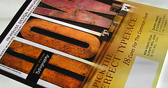
Seriously, go buy this magazine now and go to page 74 to see for yourself how fantastic the graphic illustrations are, but don’t stop there, your jaw will hit the floor when you turn the page. That is what I want to see when I pick up a magazine! The color combination of featured houses; architectural profiles of the unique structures are displayed in a wonderful organizational flow, with coordinating page numbers and details. Oh! It is so fantastic! Kudos dwell, you made my month!

I’m posting a snippet of the feature covering pages 74-114, but believe me, you need to see it for yourself and appreciate its beauty and design aesthetic. 

 And there is more info about the issue and feature on their website. Click here to go check it out. 
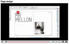
2.14.2009

Typography stimulation

Design-daily.com -- like rolling out of bed and turning the coffee maker on, going to the bathroom, checking my blackberry to review the e-mails I received while in slumber, my first-fifteen-minute-morning routine isn't complete without design-daily.com, and neither should yours for that matter. 

Today I awoke with typography in my mind. Sad? Ironic
? Good? I'm going to have to say all-of-the-above. But really, when anything can mix style, modernism and typography together, I will be happy for a long time. Seriously, the beauty of letters, words, and symbols are unique, but timeless. 

Today I laid eyes upon this table when I was looking at design-daily. The post was entitled "15 great typography-based objects." Without a doubt this table topped this list but there were so many shown that I liked, I decided that typography would be my Valentine and I will post some of my favorite typography-based objects. The table, chairs, and dresser, have already been added to my inspiration book.

M for Maggie. If I found out where this was from, I would literally design 
my room around it next time I move, which is a lot more than most people 

would assume. I am in my 9th bedroom/apartment/home/house within the past four years (and five have been within a 2 mile radius). I move a lot. It's fine. I'll lay some more permanent roots down in a few months. 
 
This last picture is the M on my bed
room door. I'm so happy to see it when I come home after long day, I feel at home. 

2.11.2009

Check this out

typographer.org posted a link to Speak Up, with an interview with Dyana Weissman, a typeface designer. A great story of how she came to be a typeface designer and grew beyond the realm of graphic design. After attending an intensive summer program in 2000, Weissman said, "I was presented with challenges that when, I solved the problem, I felt this great feeling of accomplishment, that I hadn't been feeling in graphic design in awhile. It just felt right." 
After watching the documentary, Helvetica last week, the field of typography has grown beyond Times New Roman and Microsoft Word default fonts. Typography is an art, a strategic, detailed, precise, art. I do not think I have the patience to ever become a typeface designer, but after seeing the development, delicacy and time consuming process that it takes to to design a typeface is worth appreciating 100 times more than before. 
Read the entire interview here for more insight to the world of a typeface designer, and the daughter of a graphic designer. 


Page Design

We've all done it, hundreds of times over and as designers we will do it thousands more. Every time we look at a complete piece of work and think back to where the process actually began... can be well, bizarre. I found this video on YouTube that puts the process in motion... and fast forward. Add it to your favorites and watch it every time you get a new headline to use or a new idea for the gutter space. Each detail is important in its own way. Do you like the finished product that Matt Willey did or were you a fan of some part of the development in the middle? 


Page Design by Matt Willey
"Matt Willey recently recorded his decision-making on a feature design for the Royal Academy magazine. Anyone who's designed a magazine will recognise the process -- a very useful insight into how page designs get arrived at."


Critique


Short Talk pg. 4
Originally uploaded by maggie searcy
I'm not a fast designer. A good thing? A bad thing? Does it really matter about speed of design -- putting aside the relevance of working on a deadline. But does it matter about the amount of time spent? If one person designs a draft or a department page in two hours versus someone who does it in five... it is really crucial? I guess it depends on the product, but like macro versus micro, I look at all the details in the beginning whereas I could and maybe I should design in a macro sense and focus on the larger picture in the beginning and follow up with the details in the end... time permitting.
To me the latter seems counter productive beacuase there is the possibility for poor execution and misunderstanding. By no means am I inquiring that my way is the right way, but is there a right way?
This past weekend I designed the short talk department for this week's issue of VOX. I do like my final product, but Sunday I was reminded of nearly all of the ramifications and guidelines that come with designing department pages. I was having flashbacks of what I learned, and struggled with in the beginning at Redbook: a great learning experience that is benefiting me greatly right now.

Starting before 11 o'clock Sunday morning I did not finish until nearly 4:30. Oh, the deadline for all department pages is 5; so I cut it a little close, but was even home before 5. So why am I worried? I'm not necessarily worried, just frustrated that it takes me so long. I was so worried about following the guidelines and the details laying out the spread.
Next time I design a department page for Short Talk, I hope to accomplish a good product quicker. Now that I have a better understanding of the rules and how "the rules can be broken," I believe I will have a better execution and use my time more wisely.

Click here for the second page of the spread.

2.10.2009

Epiphany: what I've learned

Last semester I put all my energy into my design class and I focused all of my attention on execution for that class and the final products I developed. I spent nights playing and learning tricks to further my knowledge of the software. Over Christmas break, even though I hate to admit it, I spent hours in Panera Bread Co. in Little Rock buying only a cup of soup or a cup of tea, and spending hours upon hours on lynda.com learning teaching myself more of adobe creative suite. 

My month long Christmas break became a daily prep course that I had hoped would throw me into instant success for the rest of my life. Okay so that is a large stretch of the imagination and moderate sarcasm implied... but I thought I would have a leg up for my last semester. I quickly came down to reality... the reality that I am still learning... learning a lot, and I never need to have a closed mind. After harboring in self-pity and stress for the past three weeks and continuously telling myself that anything I do would never be good enough or perfect enough for the level of work I should be producing... blah blah blah -- I slapped myself in the face, metaphorically that is. This is exactly what happened during the first three weeks of my internship in New York this past summer. But once I looked deeper and stopped dwelling the most micro details, things started coming together. 

Even the best cover of Esquire Magazine has never been perfect on the first try. Drafts are necessary, as is development, critique and input from others. Each element is necessary in the progression of designing and becoming a better designer. 

Because of all of this, I have taken a step back and looked at my work I have produced in the past three weeks. Instead of designing with creativity, content, and passion, I was trying to do something completely different. Something that was easier, more manageable, or so I thought. I don't want to say I clearly bombed, but I've realized that nothing is going to be 100% right -- there is always a contradiction or something that someone will not agree with. "You can't please everyone... and you shouldn't die trying..." a concept I have always had trouble grasping. 

My excitement that began growing the day I toured Mizzou and found out about magazine design, is back. Putting aside my infinite to-do list and detail oriented personality, I'm challenging myself to have fun again and have reason behind my ideas and execution instead of the mere intention to please a handful of people. 

I look forward to seeing where this new outlook takes me and what ideas become real executions.   


2.08.2009

what's on your radar?


Do you ever catch yourself trying to figure out what license plates spell out? Does you're license plate have an acronym? My license plate is 404 HRM; my dad dubbed it "her royal majesty."
I've always seemed to pass time on road trips by looking at license plates. I know, really cool. But either looking at the car's state of origin, or finding humor in a Hawaii license plate, "SRFRCHC," surfer chic. Whenever I see a good one I wish I had my camera for documentation. Look at this website for a lot of
innovative vanity plates. For my typography assignment I walked around Columbia taking pictures of different license plates, getting a good mix of letters, colors, and states. Besides the funny looks and interest in what I was actually going to do with pictures of license plates, it was a fun way of figuring out more about residents in Columbia and the wide range of information about states merely from a license plate.
Did you know North Dakota was the Peace Garden State? I didn't, but now I do.

2.04.2009

response: gary hustwit

"The subway, he says, 'is just covered in Helvetica. I wanted to know why.' And it’s not just the subway. New York taxi numbers are also in Helvetica. The font is on IRS tax forms, U.S. mailboxes, and ConEd trucks. The 50-year-old sans serif font spells out countless logos: Sears. Bloomingdale’s. JCPenney. Crate & Barrel. Target. Fendi. 
Jeep. Toyota. Energizer. Oral-B. MetLife. Nestlé. Once you realize Helvetica is everywhere, says Hustwit, “you just can’t stop thinking about it.'"

The passage above is an excerpt from an interview between journalist, 
Virginia Postrel and Gary Hustwit (pictured), director of Helvetica, a documentary film about opinion and feeling towards the nearly universal typeface, Helvetica. To read the entire article from the Atlantic, click here.
Our class watched the film yesterday during class, and I really couldn't believe how much Helvetica is actually used. From the signs in the subway to the American Apparel logo.

During the phone interview, Postrel asked about the responses Hustwit received after attending 90 screenings around the world. His audiences ranged from general documentary film lovers and graphic designers along with typographers and students. 
Hustwit made the comment, "One thing I discovered was that graphic design students are exactly the same in every country and even look exactly the same. They wear the same clothes. It is a truly global network of designers. I did feel very much like I was showing the film to the same group 90 different times."

Kind of silly, but oh so true. Hustwit isn't finished making movies. He will be showing a new documentary, Objectified in March at South by Southwest. This film is about ordinary objects that we use everyday and the designers behind them. Hustwit isn't straying from his desire to soak up knowledge of objects, how they're designed, and the impact they have on our everyday lives. Check out the interview with dwell.com's blogger, Miyoko Ohtake.


Check this out

Bored with Times New Roman? Need a new default font? There are cures for the common font according to a feature in HOW Magazine. Typographer.org posted a blub with the February issue with cover story and feature by Stephen Cole, Type Director at FontShop.
  • Do you use InDesign? or Quark? Scared to change? Check out this article also in February's issue. "Our vetern technology columnist lines up QuarkXPress 8 and InDesign CS4 for a head-to-head comparison. Both programs have extensive new features - so which one is right for you?"
  • "HOW recognizes the best work from designers in leading corporations and organizations. See the 97 winners this year."
  • (Captions from f+w magazine store. Check out more content from the issue here.)
The entry sparked my interest when I read it and I wanted to see and read the new issue. After I was unable to find the issue at a couple of locations in Columbia I went ahead an ordered it online. If you know where it is available in Columbia let me know for future reference, and to save $3.95 on shipping.
The magazine should be in my mailbox within 3-5 business days, so until then I'll leave you with a glimpse of the cover. 
HOW 2.2009

2.03.2009

field notes day 7


yoga mat(s)
Originally uploaded by maggie searcy
I took this picture thinking my yoga mat looked really cool from above. Then looking at the picture a second time it reminded me of two 'o's or vertically, an 8. The yoga mat is being reflected in the mirror on the wall. So at first glance is there one yoga mat or two? What did you think?

2.02.2009

field notes day 6


bookcase at a glance
Originally uploaded by maggie searcy
Returning from Iowa, I proceeded to reorganize everything, and I mean everything in my house. From pictures on the walls to alphabetically colorizing my closet, I relaxed from a hectic weekend and cleaned. Opposed to what you might think, I enjoy cleaning/organizing... it's a great way to relax and be productive. I snapped a few photos while I was in the process of cleaning up my bookshelf and I really liked this photo. I'm drawn to the vertical lines and repetitive pattern of the books which are broken up by the spilt coffee mug.

2.01.2009

field notes day 5


mixed media
Originally uploaded by maggie searcy
Art can be found all over Columbia. From a painted electric box on a light pole, to the stain glass windows of a church downtown, art is apart of the atmosphere in Columbia. Saturday, after watching Slumdog Millionaire (which I highly, highly recommend), at Ragtag Cinema, I noticed a panoramic piece of artwork hung on the buildings exterior brick wall. It embraced Missouri with creativity, history, and style. This is only one section of the piece, and I chose it because of the attention to detail and the dimensions that can be seen.

field notes day 4


wood grain
Originally uploaded by maggie searcy
Wood. Patterns of wood are delicate but hard and have a story in every ring. The circle of the wood shows shape worthy of inspiration and attention to detail. Running all over town Saturday I stumbled upon a hardwood floor that grew out from the center and reminded me of a million year old tree. It was incredible and worthy of today's photo.

field notes day 3


aprons
Originally uploaded by maggie searcy
While in Iowa on Friday I found piles of color all over the place. From the snow on the ground, to the red doors of an auditorium, there was color everywhere. These aprons caught my eye because of their vivid colors, patterns, and unorganized- but actually organized display.