I'm merging my life into one blog. I know, crazy. Beyond the Gutter will now be incorporated into Manic About Manhattan -- my life blog on design, new york, events, spaces and places.
MS
9.25.2009
8.24.2009
The big move. Check.
I apologize for not updating recently. I have been moving things from one state to another, and then forwarding boxes to another address. Well, I finally have a permanent address. A permanent Manhattan address. 10023 to be exact. While I keep this blog about design, I have another blog that I update frequently with my adventures while living in the City again.
Before leaving Missouri, I packed most of my life in boxes labeled "for NY" or "for HOME." Most everything that was to go home found a nice little resting place in a climate controlled storage room about 7 or 8 miles from my parents house.
When I got to New York I arrived at a friends house, slept on the floor, then upgraded to a twin air mattress while I searched for the perfect apartment. Once I found my new home in the Upper West Side I walked 13 blocks to Bed, Bath & Beyond to purchase a full size, pillow-top air mattress (I know it was a big step)!!! Three weeks after living out of UPS boxes, a suitcase, and an empty apartment, I made the upgrade. I bought a real mattress. I also purchased a bed frame, but like half of the furniture I wanted, it is on backorder until September sometime, which in delivery terms means I might get it around October. Surprisingly, I am able to fit a lot in my little apartment in the sky.
I found this desk and bookcase at Crate and Barrel. My wonderful 27'' LCD Cinema screen for my computer is still in Arkansas, but when it arrives, it will have a place to live. Check it out.

I only have room for two pieces (this picture displays all three). The bookcase has arrived and I put it together easily, but the desk, like my bed frame, is backordered until September sometime. But when it arrives to New York, I can finally have my big computer screen shipped up. Aren't the lines great?
Living in a small apartment there is not much room for a lot, but according to designers on HGTV, the more vertical furniture that breathes in a small space, the larger the room will appear. So true. My apartment is taking shape and beginning to feel like home.
My design radar has been focused on furniture lately.
When all the pieces finally come together, I'll fill you in, but until then, you'll have to deal with photos from Crate & Barrel.
4.29.2009
check this out
 I know I have written about the Storage web site for several weeks but I haven't shown you all the link or anything about Storage so... here's a screen shot of the home page. Link to come, honest, but until then this should quench your thirst.
As of 8:00 a.m. tomorrow morning, the prototype for Storage.com will be finished. Finished whether we like it or not, but I am really happy with the way things have come together.
The design styles of my group members have come together to create a cohesive package that I am proud to show Meredith Corp. next week.
We still have tweaks to make to night and a few more-than-minor adjustments to make but the end is in sight. I'll give you a sneak peak of the past four months of my life and how I dove into web design and have basically become obsessed.
Good news
The semester is winding down, insanely fast. I only have 3 days of class left. (Don't be fooled, this includes tomorrow as well as next Tuesday and Thursday) As much as my friends have been complaining about motivation and "senioritis" I don't think I have actually had time to give up on school, or get burnt out. I'm just as in love with my classes as I was the day the semester began, although I really wish I had the knowledge I have now back in January --- I believe I would have had a lot more sleep. But that's besides the point. If you sleep all the time you miss all the fun.

Okay for my exciting news of the week --
Earlier in the semester a friend of mine was working on her senior capstone class. Her project was to put together a campaign plan to raise awareness for STD testing on college campuses. (Six groups would be coming up with different concept for the same campaign). She told me what they were looking for and commissioned me to come up with their logo. I said cool, no problem. Since I did the logo and art for their prospectus I haven't thought twice about it.
On Monday the group was told the Center for Disease and Control had chosen their project as the winner. On top of winning, they received a $40,000 grant to execute the campaign and put it in action. My friend called me and told me my logo will be on college campuses in the south and be put on banners, flyers, everything promoting test awareness.
I can't wait to see it all happen. I'm still in shock that something so small has turned into something so big!
Question and Response
How many magazines is to many? How do you know which ones to keep and which ones to toss? Slowly, (emphasis on the slow part) I have started packing up clothes and frivolous items that I either do not want to take with me to New York or stuff I should just donate to Good Will. In an effort to make the moving process smoother in May, I am asking myself a serious question --- “Can I take all my magazines with me to New York?”
Don't laugh. I know if my dad is reading this, he has already rolled his eyes and probably cannot believe I am even asking this question, but seriously, I have magazines that I have read forever that I have marked and tabbed with post-its, and there are the essential years of Esquire, GQ, Domino (sadly, the complete collection), and stacks upon stacks of fashion, health, alt weeklies, crucial inspiration magazines, niche magazines that just make me smile (i.e. Scrapbook etc.), and countless news and entertainment magazines.
And people say the industry is going to die? Not if my weekly financial allotment depends on it! You would think I subscribe to numerous magazines but honestly, I only subscribe to five. The main reason being that in the past four years, I have had nine addresses -- across the country. I would rather pick up the newest copy of Beautiful/Decay or Frieze the day it hits news stands than wait impatiently to see if they have received my forwarding address.
As if this is the biggest decision of my life right now, which honestly, it's on the bottom of the totem pole in reality, I started asking myself this question on Friday night while I was working on end of the semester projects, portfolio work, and my Web site. I was reorganizing sections of my room and I started to tackle my shoddy bookcase. The pure weight of books have broken two of the shelves so they all lie on top of each other --- organized but looks dreadfully messy. So, instead of writing a paper that night I ventured to Staples. I went to get new tape for my label maker but since I was there, what could be the harm in looking around?
Well, a few Jackson's later and I have a whole new way to store a quarter of my magazine collection --- and it all coordinates. I picked up a few matching magazine holders while I was wondering around Staples and then had a field day putting everything together and having my bookshelf look somewhat less like a tornado hit it.
Check out these cool magazine holders I found:


So back to my original question, which magazines are crucial in the packing dilemma and which ones, *hold your breath, are worth parting with?
In reality if I were moving anywhere I wouldn’t ask twice about which mags to toss and which to take, but considering the fact that I will most likely be living in a shoebox of an apartment, this subject becomes excruciatingly difficult. If you have any suggestions, please tell.
4.15.2009
response
I should be stressed out. I should be worried about getting everything done before graduation but I'm not. It is all going to get done. I know myself too well. I won't let anything go undone.
Easter weekend was different this year. Usually I spend it with my family, visiting my cousins, and enjoying the "Spring" weather back home... implying that home doesn't ever see the season... it goes straight from semi-cold to hot.
This past Easter weekend was spent learning languages. No, not dialects from around the world, more like a special interest "love language." By this I mean the love of design: action script, CSS and HTML were on the forefront of my mind for 72 hours.
I took a long run on Friday afternoon to clear my head and get out all the built up energy that was accumulating over the week. Afterwards, I sat in front of the computer, learning codes and building our Web site for Meredith Corporation. I really can't be more pleased with our current product. It isn't finished yet, but by next Wednesday it will be and I will probably be more excited.
Some people learn more from other people but in my 21 years of life I have learned that if I jump right in, I'll figure out how make something/anything work. As I've gotten older I have become a bit wiser. I realize and believe you can't do everything alone -- if you think you can, you'll go crazy trying.
Working with a team of people for numerous projects this semester has had its ups and downs, its challenges and its successes but the result isn't the big picture -- it's what I have gained through the process. Seriously, I have learned a great deal from my peers this semester and I credit them with a lot of my creative inspiration. They have opened my eyes to a lot more design elements and ways of execution. This is one of, if not the biggest reason I love what I do -- I'll never stop learning, and I'll never know it all, and that's so cool!!
So if Adobe comes out with CS5 in a month (which as far as I know, nothing of the sort is happening) I might complain because that would be ridiculous, but in reality, I would be so excited to learn the new shortcuts and updates.
This past week we have been discussing conversations we have all had with design directors, graphic artists, and many others in the industry. Not only have I posted two countdowns until graduation around my house, I have been looking at apartments in New York every night before I go to bed --- but I promise I have a life, although design is and always will be a huge part. I interviewed Kristin Fitzpatrick, design director of Marie Claire magazine earlier today and just thinking about my future makes me smile subconsciously.
The country might be in recession but it won't stop me. The job market might be tougher now that than in the past, but the good news is --- the real estate is lower that it has been in a long time in New York. I am literally on the edge of my seat waiting, a tad bit impatiently, until I move. Columbia, you have been good to be for four years but I believe it is time to move on... hopefully somewhere ten times bigger... at least.
4.06.2009
Critique
Last week is over! I can't believe I was in New York for spring break a week ago. It seems like that was months ago. More than two-thirds of the semester are complete and in the large scheme of things it has gone by faster than Phelps, but on a day-to-day reality it's more on the level of training for a half-marathon -- long and tedious.


Things have become easier over the past 10 weeks and new challenges have surfaced. The phrase 'take it with a grain of salt' has become more of a daily reminder towards everything and the feeling of stress has become a medically unsolved mystery, but other than that, life couldn't be more great! I keep asking myself what I am going to do on Monday, May 17, and honestly, I have no idea. I don't know what I am going to do with myself when I don't have 500 things to do in each 24 window -- somehow though, I think I will survive.
After completing two editing exams, a Storage presentation, a personal web site critique, and a couple of papers (for those other classes I'm taking but never write about) the week finally finished with a gorgeous sunny Friday afternoon. Although I can't boast about much, I had three cover designs for the April 16 issue of Vox. I did a couple of very simple typography covers about Earth Day but it was pretty pathetic. Luckily, we got the weekend to work on our originals and resubmit them this morning.
The cover story, as of last night, was still not finalized so I was designing around two different themes -- Earth Day and School Safety. Very opposite I know, but both were fun to work with. Here are the designs I submitted this morning.
For Earth Day:
For School Safety:
4.05.2009
Esquire's Epiphany - May 2009
April 10 might be the most anticipated day of the month, other than April 30 (i.e. when our Meredith projects will be finished). Friday, April 10, the "How to be a man" issue of Esquire will be released on newsstands. Hopefully that includes Columbia, Missouri!

No, I'm not anticipating the articles of how to become more manly, or anything of the sort -- I am excited because Esquire is releasing the first-ever Mix-'N'-Match magazine cover.
Justin Timberlake. Barak Obama. George Clooney. What do the three have in common?
Honestly, I have no clue -- an ex-boy-bander and Mickey Mouse club member, the first African American President of the United States, and repeatedly one of America's sexiest men? Seriously? Well mix-and-match one of 27 different "manly" cover's and I'm sure we can all find something they have in common. In case your wondering how this phenomenon is going to work, check out the directions... compliments of Esquire.com:
How to Use Esquire's May 2009 Cover (video tutorial)
1. Tear top two pages at the perforations. If at bookstore or newsstand, please pay first.
2. Using the twenty-seven possible combinations, create your own composite American man. Reflect.
3. Promise never to defile our magazine (unless otherwise instructed) again.
Note: You don't have to tear the cover apart if your imagination is particularly vivid.
With everything that has happened in the print industry over the past several months, excitement and originality are hard to come by but leave it to Esquire to make a stir - not that anyone would have ever question them.
Playing it safe is boring. Playing it safe month after month is really boring. Playing it safe month after month in this economic state is going to produce more negativity towards print publications and increase the potential for magazines to cease existence altogether. Whereas, I do not think the above comment will ever be true, playing it safe and sticking to the same content isn't exactly going to boost sales -- or at least that is what I learned while earning a business minor.
Not only is it my style or personality, but I've always been one to push the envelope as far as possible. Maybe it's the "youngest child syndrome," or the stubbornness mixed with persistence that I learned from playing sports all my life. Regardless, it's just another reason Esquire has always been on my inspiration list. From design and 'dare-devil' mentality, to first person storytelling and humorous, unique content, Esquire appeals to the masses, whether an avid reader or not, this magazine will always spark conversation.
I am more excited to pick up Esquire's May 2009 issue than I am to graduate. OK, maybe not that excited, but leave it to Esquire to push the envelope even more. The main reason I enjoy reading and looking at Esquire is because they are not afraid to take risks. As the Obama issue in the beginning of the year set a new precedent for an interactive connection with magazines without including a "www" affiliation -- this probably isn't going to be the last Mix 'N' Match we see.
Idea for graduation gift --> All magazine subscriptions forwarded to a New York address
3.30.2009
Saks essentials
 From posters for Obama to an entire Spring 2009 catalog for Saks Fifth Avenue, Shepard Fairey is hands-down an inspiration. Who would think of taking a Soviet spin onto a classic staple of American fashion? The Streets Online posted about Shepard Fairey and his recent ups and downs.
"The campaign titled 'I Want It' features the typical Shepard Fairey color scheme: red, white and black with big block letters, and Soviet-era graphics spirit of Constructivism art. The campaign posters feature various models wearing high-end brands and individual products." -- an excerpt from the original post. Click here for the entire piece.
If you haven't had time to run by Saks front windows, or pick up a copy of the latest catalog, I suggest you get on the ball. Being in New York last week I was pretty short on time, but I ran into Saks about 30 minutes before they closed to grab a new pair of RayBans, as well as the spring catalog -- and honestly I don't know which I am more excited about, the sunglasses or the book of inspiration!
While some look to Fairey's creation as creative, cutting-edge, and a breath of fresh air, not all agree. Thumbelina Fashionista posted on her blog about the discomfort she experienced when flipping through the catalog. Read it -- straight from her post:
"It appears that this version of their recycled "Want It" campaign is an embarrassing attempt at reviving a dying megachain. Unfortunately, its marketing department has lost sight of its customer base in an almost bipolar frenzy. Women want to feel passionately about clothing, and any attempt at a thinly-veiled, ironic allusion to the 1930s and 40s only leaves the customer rebuffed and offended. After all, economists may talk of the Great Depression with legitimate alarm, but when its cruelest images merge with high fashion, the message may indeed cause the death of its messenger."
I do not have such strong negative associations with Fairey's design and that of the economy's current state. Maybe I'm taking it with less seriousness, but if we can't poke fun of ourselves then we're going to continually be upset. By taking the irony from the 1930s and 40s and presenting it today is a bold move, but one that should be respected. When I look at the era of our country's depression then, and our current situation, I see the positive side -- look how we came out of the Great Depression and look at how our country has evolved in the past 70 years. Just thinking about that, I have hope that good times are around the corner. Thoughts, opinions, please share?
Return to Reality
Getting away from Columbia for a few days was great. Being back in New York was great -- even though I always had GRE study cards, grammar notes, and my sketchbook with me, I was still able to relax, have fun and get away from the everyday stress that inevitably comes with the last six weeks of college.


Most people imagine a vacation to be a getaway from reality, a time to be carefree and welcome laziness with open arms while practicing schedule-free days. On the contrary, I get bored... quickly when I take a "vacation" like that for more than... two to three days. For me, New York is a vacation. I don't have to be connected to my e-mail 24/7 because I can truthfully say, "I was on the subway and I didn't have a signal." It's so nice. Above all, I enjoy the fact that I can read more for pleasure when I am in the city opposed to any other time. Riding the subway is one of the best ways for me to de-stress and relax, it's a free opportunity for "me time."
One of my New Year's resolutions was to read more, out side of school requirements that is. Last summer while I lived in the city I was finishing close to two books a week. I haven't been able to do that since I was in high school, if ever. When I am in Columbia, finding the time to read books leisurely is nearly impossible. I really think the subway is a big reason I like the city so much. I just have to get on, sit down, and ride -- not controlling a thing. I have no internet, no cell phone signal, nothing, and it's actually fantastic. Last week I was able to read a couple of books that I have been meaning to read for a while now.
Randy Pausch's Last Lecture was the first book I read and could not put down. I read it walking in the city, sitting in the subway, eating lunch, pretty much anywhere I could. If
you don't have time to read the book, at least check out the video on YouTube. It was inspiring to read this book while I was job hunting and searching for apartments. One of my favorite comments from Randy is this, "We can not change the cards we are dealt, just how we play the hand."
I suggest picking up the book. It is a quick read and has thought filled information that will benefit you at any age, time or place in your life.
Now that I am back in Columbia, after driving through a snow globe -- literally, driving from Kansas City airport to Columbia was full of snow
... so much for Spring! With only 47 days left until graduation I can't begin to get "senioritis," I have to much to do, and too little time to finish it all.
We met this morning to present updates of our website projects with faculty and the publishing team. It went well and the feedback we received was helpful. I keep thinking that "once we get more concrete, this is will become easier," but I'm pretty sure I'll graduate before that happens and we are scheduled to finish in about a month. Deep breath. We'll get it all done... always do. Here are some of the redesign elements we worked on. Let us know your opinion on which you like, what you would change, etc.
The Original:
The Redesign:
3.18.2009
two worlds collide
 While I try my hardest not to think solely on New York 24/7, I am finding any and every excuse to talk or write about it. Including my google searches. This past week while everyone in our class discussed their thought process and ideal design environment, I realized many of us do things the same, as well as completely different. I for one like to have the TV on when I'm designing, but I keep it on mute. I keep earbuds in my ear, but don't always have music on. Lately the music has been classical symphonic romanticism. But not matter what I come up with to "get the juices flowing," the creativity is not going to come until it comes. And then the hyper-focus sets in and nothing can distract me. Tonight I was typing anything and everything into Google to see if I could find things to inspire me.
Try searching "typography clothing." 83,300 results appeared. American Apparel, a store I will not leave NYC without visiting (at least once) has a perfect example of clothing and typography -- mixed with a little helvetica of course -- that might be the understatement of the year. The only problem --- WHAT LETTER DO I CHOOSE???
MM for Margaret Miles??? GG for Gossip Girl??? --- okay not seriously but it is, sad to admit, the highlight of my Monday's.
Other favorite typographical apparel that I found consisted of numbers and with the "pet issue" for vox streaming through the back of my mind on a constant basis, I also found a shirt that represents ---- dog lovers of America.

ahhh da luck of dee irish!
I'm not Irish and I'm not Catholic... but a day devoted to GREEN is a holiday I will not leave off my calendar. Yesterday I woke up and threw on a t-shirt, and yes it was green, as is my computer, ipod, backpack and cereal bowls. Don't judge -- green just happens to be my favorite color, and might I add, my minor obsession with green began far before the "green movement" became the season's hottest trend.

The sun was out, the weather was nice, spring has hopefully come to stay, but before I hold my breath for that dream, look how St.Patty can be translated in typography. Typographer.com posted a special deal from Porchez Typofonderie. Instead of spending endless dollars on coveted type families that I, as a college student can merely dream about, an alternative might be my dream come true.
Single weights of selected fonts are now being offered -- seriously, compared to a whole family for $247, I would gladly pay $22.47 for a Central European character set -- regular, alt caps preferred. If you've got leprechaun's cruising down your creative highway, then Kelly Pro could be just the font face for you.
Since every other industry seems to be diving into sales or low price promotions, it's about time the design world tap in. Kelly Pro might be used as often as you find a pot of gold at the end of a rainbow, but the idea to sell individual character sets opposed to entire font families is appealing. Ahhhh, it must be da luck of dee irish!
Response
For the past week I have not touched my logos. I have wanted to but I haven't. When I design things the first time, it's like a formality, I merely do it to get it over with to get on to my next idea. Last week I posted a few of the logos I have done for the mindfulness project, Eat for Life. Yes, that's right, the program is eat for life, not food for life as I suggested in each logo design I created. Where was my head? I know I don't do my best work during late hours of the night --- or in my perception early hours of the morning --- but somewhere between brainstorming, mind-mapping, sketching, discussing and executing, I changed food for life into eat for life. A problem that is easily fixable (which is taking place in my redesign) never caught my attention until two classmates mentioned it. Clearly I hid the flaw well, since my blog post contained samples of the logos, but then again, only a handful of blog followers knew what the actual title should have been.

New York City! This time next week I'll be on the wonderful island of Manhattan. It feels like yesterday I was waking up in Stuy Town, walking three blocks to catch the train and reading countless books throughout the summer while commuting to Columbus Circle where I would walk up 52 stairs, stop by Starbucks for a chai and head into the Hearst Tower for to begin another dream filled day.
Thinking about it, my adrenaline rushes and my heart skips a beat. I know I have mentioned it before, but it might be the quote think about most often -- "You miss 100 percent of the shots you never take." - Wayne Gretzky
I've never played hockey nor been graceful on ice but the concept still applies and my dreams can only be as big as I can dream. Luckily, I have a giant imagination and the determination of a bull.
As the economy slowly creeps up and the idea of getting a job becomes more and more real, I pose the question: Why settle?
3.11.2009
Think you know your fonts?
So ilovetypography.com remains one my favorite blogs, even though I am covering it for class. Think you know your Helvetica's from your Frutiger's? Try Deep Font Challenge and put your design knowledge to the test. And it's a great way to distract yourself for a while.

Check it out
For the past week or so bloggers have been responding to a post made on hellyeahdude.com and as a designer I completely agree with what he says. Art, no matter what the content, medium, or final product, there is always a deeper level within the design. Someone may not see the Appalachian mountains within a abstract mural of your mom, if you, as an artist see it, then it's real. Conquering the depth of design and impact level of art is arbitrary. Like the epiphany that I remind myself nearly every day - if I was designing to please every person, then I would be trying to do the impossible, thus never being satisfied, or happy. 
As designers if we listen to that voice ins
ide of us that says we can go beyond our wildest imagination and dream farther than the ends of the earth then we can achieve anything we want, as long as we please ourselves along the way.
Check out hellyeahdude.com for more responses about this niche narrowing comment.
Response

I'm giving this response a early because I have yet to present in class, but yesterday, as well as next Tuesday, everyone in class is presenting out creative process through sketches, execution as well as environment.
For me I can really be anywhere, because once I start designing, I hyper-focus and tune everything else out. This applies to most anything that I highly engage myself in - whether it be running outside to the beat of my own feet hitting the pavement or sitting in a crowed coffee shop, I am able to zone out and concentrate only on what I want to be thinking about. This can be perceived as good or bad but most of the time I think it is a good thing.
Lately I have been laying my yoga mat in the middle of the floor, turning the TV on mute, pulling out my computer, sketchbook, inspiration binders and magazines, etc. then sitting down and finding the right radio station at pandora.com. Lately it has been classical symphonic romance at a moderate volume level. The energy coming from classical music can influence an array of emotions while designing and have an impact on the finished product.
My design process has changed somewhat over time, but in some regards it has remained the same. I still think revisions are always necessary, but how many revisions are enough? When is a finished product actually a finished product? When the deadline comes? When you're tired of looking at it? Or is it actually never completely finished and we all just turn in incomplete work? That is probably a stretch but hey, nothing is ever too far outside the box.
I found this poster online and it made me laugh, and think of what I have to tell myself during my process of designing.
Critique
This past weekend I worked on the department pages for tomorrow's issue of Vox. It was my second time to do the Short Talk section and I think it is going to look good. I had some difficulties with to m
uch text with one story and not enough for another and one story had a
n abundance of photos and the other did not, so it was a challenge to fit as much content as I could, while keeping the overall appearance of the department looking cohesive. I will post pictures of the short talk d
epartment tomorrow when I get the .pdf's.

I was also working on a few logo projects this week.
One is a campaign adve
rtising free testing for
STDs to students at certain schools in the south (that's the summary of the project I got anyways). But once I got the slogan I was jotting things down left and right with ways to play with the typography and make it appealing both large and small.
I used bold color to grab the attention of students as well as a recognizable font... Eurostile (the same, if not very close to the type family used by Trojan). It is a subtle but humorous spin that I took with the logo. Check it out.

That must have been the theme of the week because I think I've been designing logos or at least thinking about logos all week. Another project I was working on was coming up with 20 different ideas with the intention of executing 10 of them. This posed both a helpful way of designing as well as a painful way to design. I started out assuming the obvious and was just putting ideas on paper, but then I started getting deeper and tried several different approaches for the logo and my ideas definitely evolved more as my brainstorming and execution process unfolded. The logo is for a mindfullness eating program for faculty and staff at Mizzou. It is to help relieve stress, help one enjoy

eating and enjoy exercising. Promoting a healthy lifestyle is the overall goal of the program. I started by picking colors that are commonly seen in produce. Then I started playing with the letters and typefaces. After working through this project and coming up with so many ideas on the front end I thought my execution process would be much quicker, which in reality it probably was considering I did ten different mockups.

My conclusion after completing this 20/10 assignment is that developing logos is harder than it looks. Especially iconic logos that you know so well and are easily recognizable. Believe me, a lot of
thought went into that target symbol for Target and the smiley face for Wal-mart.

3.04.2009
critique

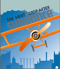
Whew! True/False took it out of me. Three days of working on the feature spread two weeks ago followed by three days of nonstop film festival fun was exhausting but totally worth it. Last Thursday the feature that Lauren I did together was printed and I am really proud of the way it turned out. Here is the finished product. I am really happy with the way the package came together. Lauren and I worked together well and were able to compliment each other within our design styles. For example at the beginning of our design process we told each other we would brainstorm at home and bring ideas to the table the next day. We were both working on the splash page and knew we wanted to incorporate the theme of "flying high/rising above." Meeting together the next day we showed each other what we had worked on. I had been working on a pl
 ane illustration and Lauren had been working on a background/skyline illustration. Our two pieces worked great together, and from there we accomplished an entire package that I know we are both proud of.
 This past weekend I saw several films including No Impact Man, We Live in Public, Food Inc., Rough Aunties, and several others. It was relaxing, enjoyable as well as informative. I bought a glass gallon of milk which was produced at a local farm in Missouri when I was at the grocery yesterday. This decision, a 40 cent increase compared to the generic plastic brand of skim milk I usually buy was influenced by the film Food Inc., which encouraged

audience members to know where their food is produced and its environment
of origin. Although when I left I was a bit petrified, I decided I could do my
part in hopes of regulating the FDA. So glass gallons of milk from Hermann, Mo. are looking even better now, and taste better as well.
One of the best films I saw was Big River Man. The story of an endurance swimmer who weighs over 200 pounds, and not of pure muscle; who drinks like a fish, and chooses to be the first person to swim the Amazon River. Don't believe it? Google it; it's legit.
2.25.2009
more work to show
 Here are some updates on the work I have been doing in the past week; I know I have posted about it all numerous times but I haven't shown it. Well ta-da: the good, the bad, the ugly, and the published.
The series of pictures is the progression of where my thoughts started with the concept of bed and breakfast and where they ended, or how they ended I should say.
As you can see my thought process changed quite a bit while working with the theme of bed and breakfast. The top is the finished product, and the order of the pictures shows the progression of designs I went through before deciding on a concept and final design. I wanted to play off the idea of old vs. new, to get the feature a "Vox feel." Once I did the color vs. black and white, half and half approach, I wanted to run with it. Finding the right image was crucial. As you can see from the blue image I only found a black and white photo and had to show interpret what I meant on my own. But the idea sold and we went with it. I think the cover turned out nice, classic, "kitchy" if you will. 


What the font. check this out.

I'm addicted to my Blackberry, or as known to most as, the crackberry. But seriously I might be able to go to identifont.com and find the font of a unique font, my blackberry cannot do this --
typography.com posted a test they used from a random sign to see if "What the Font" really worked. Check it out, it's pretty close and it's like "identifont" at your fingertips. First the iphone can gchat, now "what the font!" really, maybe i need to upgrade. If I said it was necessary to have a font identification program at amy fingertips I could convince my parents that I cannot go on another day as a designer without this program, or aka, the iphone.
A bit dramatic, but I haven't been overly impressed with many iphone applications that I have seen. Come on, who can beat Brickbreaker on the Blackberry??
critique
WOW. I have survived the past two weeks. I’ll admit, at 6:00 a.m. last Wednesday when I was still awake working on one of about 500 projects, I was asking myself why I really care so much and why I am so concerned. I see people everyday who don’t have a ton of work to do or don’t care about school, but I can’t relate. It’s totally not my work ethic.
I mean, come on, I’m trying to come to terms that I can’t actually accomplish everything on my to-do list before 10:00 p.m., which yes, was the usual time I went to sleep before this semester again.
In the past 24 hours I have realized yet again why I love designing, why I am passionate about the amount of picas between the head and dek of a feature, or the about of points the thickness of a stroke is and how each detail can make a huge impact. Ah! It’s like a love language!
The math side of my brain got to me today and between 2 o’clock on Friday and 5:30 on Sunday afternoon, Lauren and I spent nearly 30 hours at VOX. Even with the infinite playlists, courtesy of Pandora and the slaphappy humor that evolved over our lack of sleep, we put all we had into this week’s feature. Oh! I am so excited to see it in print tomorrow. Before I reveal the entire thing, the picture to the left is one of the first drafts of our splash page. The feature is on the True/False film festival that is taking place in Columbia this weekend for the sixth year.
Lauren and I had a product we were proud of, but things can easily change when we begin getting inputs from other people – always a good thing, but not always something I want to hear. I had become attached to this red box that anchored the first page of the feature, but since we are limited on space, the “blank space” of my red box had to be tossed, and text had to be added.
The moral of my critique is hard work does pay off. The hours of brainstorming, learning new software techniques, and designing as a pair, was a learning experience as well as a boost of encouragement after completing this huge feature.
Of all the time I have spent on the computer, designing and creating the past week, I never got burnt-out. I wanted to stay up and make my designs better and keep executing ideas but I finally had to let myself sleep. The adrenaline rush that has come over me in the past 48 hours has put me on a high... and reassured me that I am in the right place, doing the right thing, --doing what I love.
Sometimes reassurance that you’re doing the right thing and you’re on the right track is a positive reinforcement that hard work does pay off.
And sometimes, even through all the stress that life brings, and the endless to-do lists, a lot/if any reassurance is recognized, and coming at this time in the semester, I think this is a push to remind me “why I love what I do!”
2.17.2009
Critique
The past seven days have been hard to differentiate. Last Thursday Lauren and I presented our general concepts and rough ideas for the True/False Film Festival feature story for VOX. The same day I also pitched two redesigns for the February 19 cover. I found out on Thursday night that my concept was chosen for the cover. I really like the final product. Tomorrow I will post the new cover, along with the other ideas that were generated along the way.
In between working on the cover and reworking ideas for the upcoming feature, I had to work on a draft to pitch to for my larger semester project. Needless to say, I’m turning into a major computer-nerd/design-geek that can only talk and think and yes, only dream about design. *Side note: always keep a pen and some paper next to your bed in case a brilliant idea pops into your head at 3 in the morning because if you’re like me, there is no way your going to remember it four hours later.
I am posting pictures of economy feature that I redesigned since its original post. I like these two much better than the spread I turned in the first time.


Response
What do we really do differently now that we didn’t do years ago? Has anything really changed, or has the process merely become quicker due to the age and development of technology?
Yesterday I did a presentation on Collier’s magazine. It began in 1888 and greatly impacted the industry until it closed in 1957. While researching for this project I got lost in the library stacks going through decades of the weekly publication. It amazed me to see how, (a) they were in the forefront of their competitors and reaching upwards of a million readers within the first 10 years, or (b) have we, as designers merely regurgitated ideas and designs that have already been done? Is anything really new?

Let me back up a little bit... I believe it is all of the above. The impressions that photographers and artists like Jimmy Hare, Will H. Bradley, J.C. Leyendecker and Edward Penfield have created in this century old concept are astounding. I think they were yes, ahead of their time and because their work is recognizable, brilliant, and timeless, why not take from the old and use in the new? You can say your inspiration is the propeller on a crop-duster if you take a picture of a plane flying by, but I’ll say: “the photographs were inspired by Jimmy Hare, a photographer who made vast developments within the realm of photojournalism, but also took the first photo of a flying plane in 1908.”
If we get down to the minute details and pick apart things in a micro-manner, then we can always find a way to question ideas, suggest a different source of origin, or simply say, “It’s not original.” Honestly though, if we did that, what would be the point? Why don’t we take what Collier’s did in 1910 when it was thriving and apply it to our concepts today? A modern spin on a classic.
Do you think we currently do that? In class we’ve been looking at the development and progression of magazine design from 1880s to the 1960s. A lot has changed, but a lot has remained the same, with a few technological updates of course. In the large scheme of things it has been really interesting to see how different magazines got their start, and if they were able to hold their own and press on through the ups and downs the economy has seen over the past century.
Subscribe to:
Posts (Atom)


